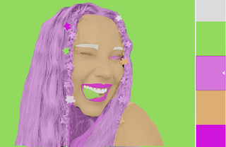
Posts

Animation Project

Image
This Animation project was probably the hardest one so far. It took me a long time to just understand the Timeline techniques and thinking of a creative way to make this animation. I had a lot of fun filming the video of myself doing yoga and editing the clips, however outlining every frame and adding the color took a long time. I would have like to have added more detail in the background if I could have figured it out a lot quicker and been more successful with it. 

Autoscopy Project

Image
  For this project I wanted to create something simple but something that had a strong effect and message. The message I wanted to convey is that especially for women, mens eyes are always on you. Whether it's them judging you, checking you out, cat calling you, or just straight up stating. The phrase "all eyes on you" that I placed on both sides of the picture were meant to convey that meaning as well as the many eyes cut out in the background, piercing at the audience. The red lines over my shoulders that are a little bit opaque are meant to cover the part that men typically just pay attention to. Just like in schools how girls are told to cover their shoulders because they are "too distracting". My eyes in the photo are staring right at the audience, sending the message that I see you and my eyes are the thing that should be paid attention to. I also blurred my face in the second one, which if I were to change anything I would reverse it and make my shoulders

Multiplicity Project

Image
  The multiplicity project was nice to have towards the end of the semester because I was able to get to know the features of photoshop so I could do the best work on this project. I enjoyed the creativity this project offered and the different things that could be done in the image. I wanted to make each person doing a different thing in the image, all coexisting in one room doing daily tasks that I do on a daily basis. I wish I had more space in my room to have each person interact more, but I do like how the edges of each person came out so clean. I was able to improve that from the previous projects.

Black and White to Color Project

Image
          For this assignment I chose I really fun selfie that I could make the effects look super cool. I struggled with making the lines of the small barrettes in my hair because they were so detailed and small that they weren't as clear cut as I wanted them to be. Overall I love the color pallets I chose. The all red monochromatic gives a sort of scry dramatic sense to the image in contrast to the rest which are more fun and playful like the selfie. I am happy with the work I did in these images and it taught me a lot of creative skills on photoshop that I can use for future projects!

Poster Project

Image
This poster assignment was difficult for me creativity wise because I wasn't sure what message I wanted to portray for the assignment. I had an image (shown below) that I had taken at the beach with a cloudy, moody background and a freckled sandy face. I wanted to play on the idea of a beach and happy vibe with the seriousness of my face. My dad has called me his sunshine since I was a baby and it has stuck with me up into my adulthood. I think about it all the time and whenever I'm having a down day I think about how my dad sees me as his sunshine and it immediately lifts me up. I think that everyone should have a sunshine in their life, and tell them that. The color pallet I chose originally was monochromatic with a dusty yellow. I wanted to try a different look to the poster to see what I would like better. The second color pallet I choose was Triad. I wanted to add some blue shades to get the beach vibe in the image as well as keeping the dusty yellow color. I personally li

Calligram Selfie Project

Image
This assignment was very fun for me because I was able to be creative and utilize my facial features with the words in the calligram. The selfie that I chose was fun to use because if the makeup that I had on so I was able to work the words into the makeup I had on to make a cool effect. The words that I used were a mix of things that I am self conscious about, things that I am passionate about and love, as well as things that I like about myself. The reason I took this approach is because I think the contrasting words and ideas make up who I am. I am not just all the negative things or all the positive things, I am a mix of both and I believe that needed to be represented in my calligram selfie!

Logo Business Cards & 3D Model

Image
  For the business card and 3D model assignment I decided to change my logo to a more simplified design so it would read better on a business card. I like this version a lot better because in my mind it is a lot more memorable and my name is more clear than on the original. Also, on the 3D models the logo fits a lot better and look less cluttered than the original but still preserves the creative aspect I was going for. Overall, I am happy with the revised version of this project and I think that my vision for this logo came out the way I wanted it to. It has that "candy shop" look to it while still being modern and cute.